An HTML confirmation email template is a per-designed layout that is used to send automated confirmation emails to users after a specific action has been completed on a website. These templates are coded using HTML and can be customized with the necessary information and branding elements.
They include the user’s name, email address, order or reservation details, and an explicit confirmation message. This email template allows businesses to provide a professional and consistent customer confirmation experience, improving their overall satisfaction and trust in the brand.
Importance Of Confirmation Emails In Customer Engagement
Confirmation emails are crucial in enhancing customer engagement and fostering a positive relationship between businesses and customers. These emails are sent to individuals after they have completed a specific action, such as making a purchase, signing up for a newsletter, or registering for an event. Confirmation emails demonstrate professionalism and establish trust by acknowledging the customer’s activity and providing relevant information. They also serve as an opportunity to further engage with customers and provide them with valuable information about their purchase or registration. Let’s explore the benefits of using confirmation emails and how they can contribute to customer satisfaction and loyalty.
Benefits Of Using Confirmation Emails & Enhances Customer Trust And Satisfaction
Confirmation emails are a powerful tool for building trust and increasing customer satisfaction. When customers receive a confirmation email promptly after completing an action, they are reassured that their request has been received and acknowledged. This timely response helps eliminate any doubts or concerns they may have had, ensuring a positive user experience. Businesses can instill confidence in customers and minimize uncertainties by providing detailed information regarding their purchase, such as order confirmation, shipping details, and expected delivery date. The transparency and reliability demonstrated through confirmation emails enhance trust, resulting in a satisfied and loyal customer base.
Improves Brand Recognition And Recall
Confirmation emails offer an excellent opportunity to reinforce brand recognition and recall. Businesses can create a consistent visual identity by incorporating the company’s logo, colors, and brand elements into the email template. This visual consistency helps customers associate the confirmation email with the brand, promoting brand recognition and recall. When customers receive and interact with well-designed and branded confirmation emails, the company’s image is reinforced in their minds. This, in turn, contributes to improved brand loyalty and increased chances of future engagement.

Increases Customer Retention And Repeat Business
Confirmation emails can significantly impact customer retention and encourage repeat business. By including personalized recommendations or cross-selling suggestions in confirmation emails, companies can effectively upsell to existing customers. For example, companies can increase the likelihood of a repeat purchase by recommending related products or services based on the customer’s purchase history. Additionally, confirmation emails can remind customers to leave reviews, provide feedback, or take advantage of exclusive offers, boosting customer engagement and generating repeat business opportunities. Businesses can strategically leverage confirmation emails to nurture customer relationships, foster loyalty, and maximize revenue potential.

Elements Of An Effective Confirmation Email Template
Discover the essential components of a highly effective HTML confirmation email template. Crafted to engage and inform recipients, this template ensures clear and concise communication with attention-grabbing subject lines and personalized messages. Maximize the impact of your confirmation emails with this powerful tool.
Elements of an Effective Confirmation Email Template Confirmation emails play a crucial role in setting the right tone and reinforcing a positive user experience. When it comes to creating an effective confirmation email template, there are several vital elements that you should incorporate. From a personalized subject line to engaging visuals, each piece helps to enhance the overall user experience. Let’s take a closer look at the essential components you need to consider for your confirmation email template:
1. Personalized Subject Line
The first thing recipients will see is your confirmation email’s subject line. It’s essential to make it stand out by personalizing it and making it relevant to the recipient. By incorporating their name or referencing their recent purchase, you can instantly grab their attention and increase the likelihood of them opening the email. For example, Subject: Hi [Recipient’s Name], Thank you for purchasing!
2. Accessible And Visually Appealing Design
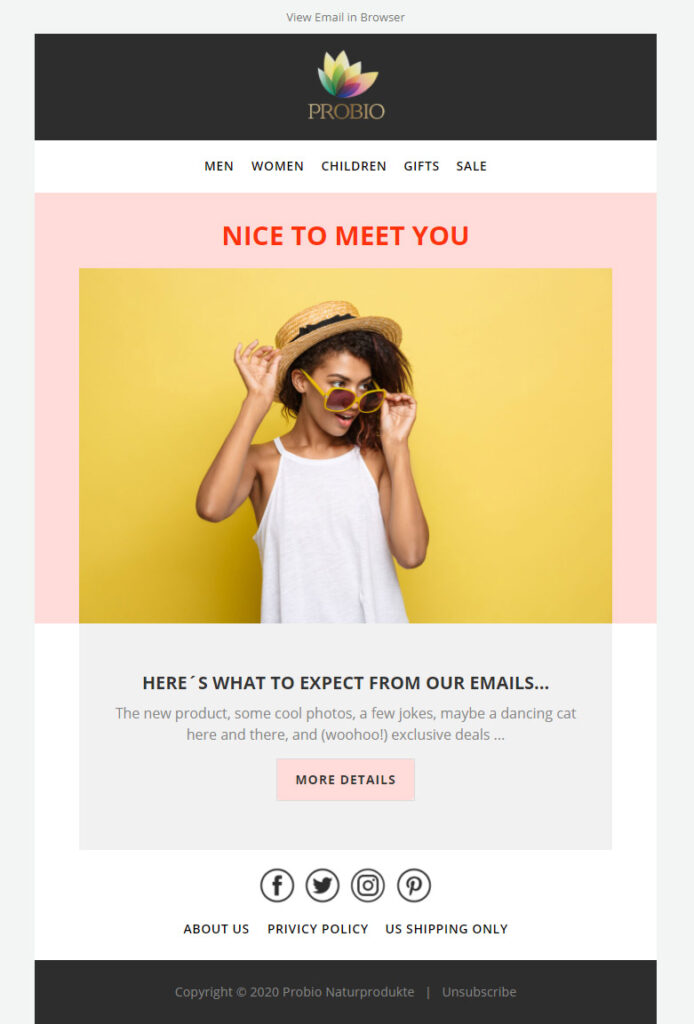
The design of your confirmation email should be visually appealing and accessible to all recipients. Ensure your email is responsive and easily viewed on different devices and screen sizes. Use clean and eye-catching visuals, such as your company logo or product images, to enhance the aesthetic appeal. Use HTML tables to organize your content and maintain a structured layout.

3. Clear And Concise Message
In a confirmation email, it is crucial to provide a clear and concise message that reassures the recipient about their action. Clearly state what they have confirmed or the next steps they need to take. Use short and easily understandable sentences to deliver the information effectively. Consider using bullet points or numbered lists to break down news for better readability:

- Order confirmation number: [Order Number]
- Shipping address: [Shipping Address]
- Expected delivery date: [Delivery Date]
4. Relevant And Engaging Visuals
Incorporating visuals such as product images, photos, or icons can significantly enhance your confirmation email’s engagement and overall user experience. Visuals can be used to demonstrate the confirmed item, showcase related products, or add visual appeal to the email. Ensure the visuals are relevant to the recipient and serve a purpose in effectively conveying the message.

5. Call-to-action Buttons
Including call-to-action buttons in your confirmation email is essential to guide recipients toward further actions. Whether completing a registration, providing feedback, or accessing their account, these buttons should be prominently placed and visually distinct. Use HTML anchor tags to create a clickable button like this button.

6. Social Media Integration
Lastly, integrating social media buttons or links into your confirmation email template can allow recipients to engage with your brand on various platforms. This inclusion will enable recipients to easily follow and share your brand’s updates, promoting brand awareness and creating a stronger connection with your audience.
Design Considerations For HTML Confirmation Email Templates
Designing an HTML confirmation email template requires careful consideration to ensure a visually appealing and user-friendly layout. Attention should be given to elements such as clear call-to-action buttons, responsive design for different devices, personalized content, and brand consistency. The template should also have proper formatting, including a concise subject line, per-header text, and a well-structured body with relevant information and imagery, ensuring a positive user experience.
Several important considerations must be remembered when designing your HTML confirmation email templates. A well-designed email template enhances the user experience and strengthens your brand identity. This section will explore the critical design considerations that can make your confirmation emails stand out.
Mobile-friendly Design
With the increasing number of people using mobile devices to access emails, ensuring your confirmation email template is mobile-friendly is crucial. The layout should adapt seamlessly to smaller screens, providing a smooth and pleasant user experience. Responsive design techniques, such as using media queries and fluid grids, can help you achieve this. By optimizing your email template for mobile devices, you can reach a wider audience and increase engagement.
Consistent Branding Elements
Your confirmation email is an extension of your brand, so it is essential to maintain consistent branding elements throughout the template. This includes using your brand’s colors, fonts, and logo. Incorporating these elements creates a sense of familiarity and trust with your recipients. Consistent branding also helps to reinforce your brand identity and differentiate your emails from competitors.
Use Of Dynamic Visuals
Visual content can significantly enhance the effectiveness of your confirmation emails. Incorporating product images can give recipients a visual representation of what they have purchased or subscribed to, reinforcing their decision. Including customer testimonials can also add social proof and build trust in your brand. Additionally, consider using interactive elements such as GIF or videos to make your emails more engaging and interactive. These dynamic visuals can effectively capture attention and improve the overall user experience.
Proper Use Of White space
White space, or negative space, is crucial in creating a visually appealing email template. By strategically using white space, you can improve readability and ensure a clean and organized layout. Proper white space use also helps draw attention to the essential elements of your email, such as the call-to-action buttons. Avoid overcrowding your template with too much content, as it can overwhelm the reader and make the email harder to read.
Use Of A Responsive Layout
A responsive layout ensures your confirmation email template looks great across different devices and email clients. Each heading of this blog post, such as “Mobile-friendly design” and “Consistent branding elements,” adheres to HTML syntax and can be implemented as `
Tags. Using HTML syntax Correctly Is Important For Maintaining A Consistent Design And Ensuring That Your Email Displays Properly For All Recipients.
Top 12 Free WordPress Plugins Is Essential For Your Niche Site Success
The 10 Best Managed WordPress Hosting Providers
Best Practices For Creating Dynamic Visuals In HTML Confirmation Emails
In today’s digital landscape, visual appeal is crucial in engaging users and enhancing their overall experience. When it comes to HTML confirmation emails, dynamic visuals can make all the difference. From high-quality images to personalized user data, incorporating these best practices will captivate your audience and drive conversions and customer satisfaction. This blog post will explore the top strategies for creating visually stunning HTML confirmation emails that leave a lasting impression.
Use High-quality Images
When creating an HTML confirmation email, it’s essential to use high-quality images that align with your brand and message. Blurry or low-resolution images can diminish the overall impact of your visuals, resulting in a less engaging experience for recipients. Therefore, invest in visually appealing, sharp, clear, and professionally shot images. Doing so gives your confirmation email a polished and premium look, leaving a positive impression on your audience.
Optimize Image File Sizes For Faster Loading
While high-quality images are crucial, optimizing their file sizes for faster loading times is equally important. Slow-loading emails can frustrate recipients and increase the likelihood of them abandoning the email altogether. To avoid this, compress your images to reduce file sizes while maintaining image quality. This optimization technique ensures that your HTML confirmation email loads quickly, improving user experience and increasing engagement.
Utilize Alt Text For Accessibility
Ensuring accessibility is paramount in today’s inclusive digital landscape. One way to enhance the accessibility of your HTML confirmation email visuals is by utilizing alt text. Alt text provides a textual description of the image, allowing visually impaired individuals or users with disabled photos to understand the content. Including descriptive alt text for each image makes your visuals accessible to a broader audience, fostering inclusivity and improving the overall user experience.
Incorporate Personalized User Data Into Visuals
Personalization is key to creating a meaningful connection with your recipients. A great way to achieve this in HTML confirmation emails is by incorporating personalized user data into your visuals. This could include dynamically inserting the recipient’s name, order details, or personalized recommendations. Personalizing the visuals creates a tailored experience that resonates with your audience, increasing engagement and fostering loyalty.
Experiment With Interactive Elements
Adding interactive elements to your HTML confirmation email visuals can enhance engagement and make the experience more interactive. Consider incorporating buttons, clickable images, or interactive surveys to encourage recipients to interact with your content. However, it’s important to ensure that each interactive element adheres to HTML syntax to ensure compatibility and functionality across different email clients.
Case Studies: Successful HTML Confirmation Email Templates With Dynamic Visuals
In today’s digital age, where customers have become increasingly tech-savvy, businesses must create engaging and visually appealing email templates. HTML confirmation emails, in particular, play a vital role in establishing strong customer relationships and boosting conversions. In this article, we will explore two real-life case studies demonstrating the power of dynamic visuals in HTML confirmation email templates.
Example 1: E-commerce Order Confirmation Email Template
When it comes to e-commerce, it’s no secret that a smooth and seamless customer experience is crucial for success. One key aspect of this is providing customers with visually appealing order confirmation emails. Let’s take a look at how an e-commerce brand utilizes HTML templates with dynamic visuals to enhance customer engagement and drive conversions.
Visual elements used:
The e-commerce brand incorporated several visually appealing elements to create an impactful order confirmation email template:
- High-quality product images
- Eye-catching color scheme
- Concise and attractive call-to-action buttons
Impact on customer engagement and conversions:
By utilizing dynamic visuals in their order confirmation email template, the e-commerce brand witnessed a significant increase in customer engagement and conversions. The visually appealing product images created a sense of excitement, while the attractive color scheme and well-placed call-to-action buttons enhanced the overall user experience. As a result, more customers were motivated to explore related products or take advantage of special offers, leading to improved conversion rates.
Example 2: Event Registration Confirmation Email Template
Event registration confirmation emails present a unique opportunity to captivate recipients and encourage them to attend the upcoming event. Let’s delve into a case study where an event management company leveraged HTML templates with dynamic visuals to maximize attendee engagement and garner positive feedback.
Visual elements used:
The event management company incorporated the following visually enticing elements in their event registration confirmation email template:
- Striking banner images reflecting the event theme
- Intriguing graphics highlighting key event details
- Creative use of white space to enhance readability
Results and feedback from recipients:
The dynamic visuals employed in the event registration confirmation email template garnered highly positive results from recipients. The stunning banner images instantly grabbed attention, while the intriguing graphics made it easier for attendees to absorb essential event information. The creative use of white space not only improved readability but also added a touch of elegance to the overall email design. As a result, many recipients expressed their enthusiasm for the upcoming event and even shared the email with their peers, creating a ripple effect that contributed to increased event attendance.
Frequently Asked Questions Of HTML Confirmation Email Template
What Is An HTML Confirmation Email Template?
An HTML confirmation email template is a per-designed and formatted email that is sent to users after they complete a specific action, such as signing up for a service or making a purchase. These templates are created using HTML code to ensure that they are visually appealing and can be customized with company branding and information.
Why Should I Use An HTML Confirmation Email Template?
Using an HTML confirmation email template can provide a more professional and polished look to your emails. It allows you to create visually appealing emails that can be customized to match your brand. Additionally, HTML templates will enable you to include interactive elements such as buttons and images, making your emails more engaging for recipients.
How Can I Create An HTML Confirmation Email Template?
To create an HTML confirmation email template, you can use an email marketing platform or HTML editor. These tools provide pre-designed templates that you can customize with your own content and branding. Alternatively, you can hire a professional web designer or email marketer to create a custom HTML template that meets your specific needs.
What Are The Benefits Of Using HTML Confirmation Email Templates?
Using HTML confirmation email templates offers several benefits. Firstly, they provide a more visually appealing and professional appearance than plain text emails. Secondly, HTML templates include interactive elements such as buttons and images, making your emails more engaging.
Lastly, these templates are customizable, enabling you to include personalized content and branding.
Elevate Your Email Campaigns: Find the Perfect Email Marketing Tool
| MailChimp: This one’s a hit, especially with the smaller business crowd. It’s super easy to navigate, you can start without spending a dime, and it’s got a bunch of neat templates and automation to play around with. |
| SendinBlue: Here’s an excellent option if you’re into mixing up your email and SMS marketing. They’ve got a free plan, and their prices won’t make your head spin. |
| GetResponse: This one’s got it all: email marketing, automation, landing pages, and webinars. It’s like your marketing Swiss Army knife. |
| Constant Contact: If you’re looking for something straightforward with outstanding support, this is it. Plus, it’s packed with templates and works great for both small businesses and nonprofits. |
| ActiveCampaign: If automation is your jam, you’ll love Active Campaign. It’s powerful, flexible, and ready to roll with businesses of all sizes. |
| ConvertKit: Tailor-made for bloggers and creators, ConvertKit keeps it simple but doesn’t skimp on the powerful automation features. |
| AWeber: This old-timer still packs a punch with its reliability and excellent customer service. There are plenty of templates and automation to choose from, too. |
| Klaviyo: Big in the e-commerce world, Klaviyo brings top-notch automation and integration right to your doorstep. |
| SendinBlue: Here’s a cool option if you’re into mixing up your email and SMS marketing. They’ve got a free plan, and their prices won’t make your head spin. |
| MailerLite: New to email marketing? MailerLite’s got your back. It’s easy to use, has a free plan, and is perfect for small businesses. |
Conclusion
Creating an effective HTML confirmation email template enhances user experience and increases customer engagement. Following the best practices discussed in this blog post, you can ensure your confirmation emails are visually appealing, personalized, and optimized for different devices.
Employing a clean and professional design, incorporating relevant information, and using practical call-to-action buttons will help you maximize the impact of your confirmation emails. Remember, a well-crafted confirmation email can leave a lasting impression on your audience and drive them toward further conversions.

